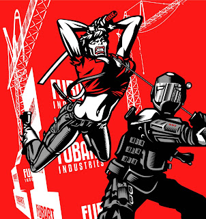
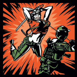
I recently submitted my final draft for the recently-released KMFDM album ‘Tohuvabohu’. However, when I saw the print version, the background was entirely different to my version. When I asked why it had been changed, I was informed by KMFDM that it had been ‘remixed’. I’m not a big fan of music and know even less of its workings but don’t artists usually have a say in how their music is remixed? It’s like discovering the babysitter has tattooed a rude name on your kid’s head.
Anyway, see which one you think rules and which one sucks.


I guess this is the ultimate problem for commercial artists. Clients. As a band and ‘artists’ in their own right, they should never have fucked with your artwork like this. Now it seems in house KMFDM artwork is as bad as their music.
Do they have any idea how long it took to build those fucking cranes?
The one with the red background is awesome! The other one…not as good…
Cheers
Kung Bläck Magazine
Personally I think that the first version looked AWESOME on it’s own. As a KMFDM album cover? Not so much. The background doesn’t really fit into what people think a KMFDM album is, and in my opinion they’ve used red for far too long.
I just hope you’ll keep making artwork for KMFDM. I love your work, and I love KMFDM. I’d hate to see you guys “break up”.
A fan.
love the first one
Ooofda .. this is a tough one. When KMFDM commissions you for a cover, I imagine that they “own” the rights to the work, am I correct? That being said, altering the work without even letting you know about it (let alone doing the actual alteration) is just bad juju. This sounds like a “well, technically they are allowed to…” situation. Regardless, your artwork fucking rawks, and I would hate to see a rift between two amazing artists that have worked so beautifully together in the past!
KMFDM is all about change…don’t let it get you down or make you angry they changed some stuff. You are obviously an influence in their art as you are in theirs. Which ever came first,whatever. It goes hand in hand. Everybody associates BRUTE! with KMFDM and vice versa. You are a fucking brilliant artist and Sascha is a fucking brilliant artist. Let it go. No matter how anything “differs” I am still saving to buy your original prints for my house. You have made fans just from them. Also, remember…..as long as KMFDM is around, you have extra income.
BTW: Most people DON’T have a say in remixes. If they release the tracks/music to be remixed, they get what someone else thinks is cool.
i forgot add about the BTW part………..it still pays homage to the original creator.
I agree with many others. The original is a great work of art. Though I don’t feel it would have fit well as an album cover as it was. The KMFDM revision does look nice on the album. I don’t condone what they’ve done, but I’m sure over the many years you guys have been working together this hasn’t happened much. I love Brute! and I love KMFDM, and I hope that this doesn’t hurt the relationship.
And I wouldn’t let “opinions” such as bogart’s be any sort of deciding factor.
to shed some light here:
a) the “remixed” version that is posted here is not the final version as you can easily see if you compare it to the cover of TOHUVABOHU.
b) i sent this version for approval and was told it was “too green”. i changed the green and used it.
c) not sure what this has to do with remixing, i simply pointed out that the background, though nice as a piece of art, didn’t “pop” enough to be a record cover.
d) since i paid for 2 pieces i needed to make sure that at least one of them could actually be used.
e) beats me why this has ever become a public discussion.
I think both are great. However, I agree with Sascha that the one they used works better as album artwork.
raw: I hardly think Sascha is blog-stalking. The guy’s defending himself.
Although I think the original version is great, it doesnt really work as an album cover. If one looks at all the KMFDM album art and compares the pieces to the original Tohuvabohu cover, you’ll see what I mean.
I gave Sascha the link to this blog, so that he could show his side, as he did cleanly and politely. I agree with Stephen, he is simply defending himself and stating his side. That is all.
I think the consensus here so far is that, while it is a great work of art and the work of art is still shown in much of its glory on the album, the original just simply didn’t fit well as an album cover. I hope that relations between you two continue, as you are both great at what you do.
And as Sascha pointed out, the image above is not the final version used on the album (I hadn’t noticed that myself until he pointed it out).
I think raw is the one getting rather “pissy” here, as he put it. I saw no evidence of Sasha being “pissy” over other comments. I think raw just read Sascha’s comment in the wrong tone.
I think the first one is great, and I’d gladly buy it as a print, but the second one just seems to fit better.
I hope you continue to work with the Band, Mr. Brute, we all love you’re album covers.
Both look great, one as a cover the other a piece of art.
I find it odd that Aiden would have a problem with this since he been in this biz for a very long time.
I have been Illustrator/Graphic Designer for about 15 years now and not one finished project with clients is my original finished piece. Either they come back to me to retouch, change, or completely redo the project to the client’s liking. If Im not around or busy with other’s projects they get someone else.
I know how it feels to spend alot of time and hard work on something you created and feel its perfect only to have the client say its not exactly what they want.
The commercial art world doesnt have as much freedoms as the fine art world has as fine art is usually (not always) a personal experience and feelings through the artist and commercial art is one or a team of artists making a product or ad to sell a product to the masses.
Unfortunatly, when your paid the money the art work is thiers, you lose alot/or all of the control of what they do after with the project. As long as you have the original or a copy of the version you completely did, you can show it off and keep in portfolio.
I have been a big fan of Aiden’s charactor designing and the prop-art style but not his backgrounds so the all red flat bland bg is just making my eyes hurt, again though, its his original so he can love the red bg all he wants.
The “remixed” one kills the nice detailing of the miltary/ninja guy especially the light reflection on his mask that is gone! for shame! But oh well, Sascha bought it so if he wants to retouch it using a pink, purple and green theme and put devil horns on the ninja guy and more obscene changes to the woman thats his choice.
I dont believe this is an ego problem just a miscommunication
about verbal contract between artist and client.
Im just alittle confused why Aiden is so shocked about the “remix”, It happens all the time in the business!
I prefer your version. I hope this doesn’t lead to a split up between you and the band, your artwork is the best!
well i have to say the star burst works better from a design standpoint because it centers it. More focus. But i dont like how they made it multi colored. The old school covers are all black, white and one other color. This bugs me the most.
They should have come to you first though and asked you to fix the things they didnt like.
okay, i’m retarded. maybe they arnt always the same amount of colors, but about the focus is still true.
The buildings look a little over-simplified and phoned-in, really unworthy of holding those spectacular cranes. I like the original color scheme, but the starbursty background gives the action of the image more intensity and puts the scene in the moment, whereas the rather placid and sparsely-rendered original background only offers an ultimately trivial locale for the figures’ encounter. The starbursty background is pretty sloppy, though.
Ditching the FUBAR INDUSTRIES thing was truly a mercy killing; the only people that actually use that term these days are black-denim-wearing dirt rockers whose high point in life revolves around the next bong-load and some domestic beer.
Actually, the FUBAR ‘buildings’ are crates and therefore not designed structurally to hold cranes.
And those black-denim-wearing dirt rockers you mention are my bread and butter, dude!
from an artistic point of view… i like the original.
from a KMFDM cover POV, i like the altered version (green or not)
but i understand why sasha would have needed to alter the picture in order to make a cover… the fubart industries logo and such does not a good cover make. but as a piece of art, its amazing.
i really hope there is no bad blood between the two of you… i would hate to see another artist doing cover art for KMFDM. please work it out.
i like both, but i gotta side with the kapt’n on this one… it was changed for obvious reasons… and you made 4 covers for them since… why is this just coming to light now?
A few fans of my Facebook Fan Page asked if they could see the original artwork a few months ago and I only just got round to adding the link. The differences of opinion were resolved amicably and production continues.
Ok that’s good to hear… I got confused as to the date of this