A nice balance of elements: minimal lay-out but with the graphic lettering to add a touch of motion.
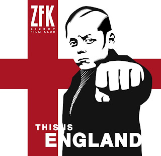
ZFK screening – This is England
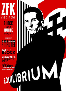
ZFK – Black & White night
New KMFDM cover
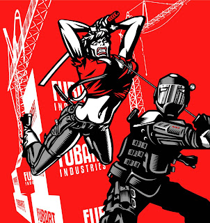
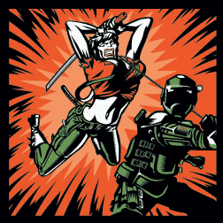
I recently submitted my final draft for the recently-released KMFDM album ‘Tohuvabohu’. However, when I saw the print version, the background was entirely different to my version. When I asked why it had been changed, I was informed by KMFDM that it had been ‘remixed’. I’m not a big fan of music and know even less of its workings but don’t artists usually have a say in how their music is remixed? It’s like discovering the babysitter has tattooed a rude name on your kid’s head.
Anyway, see which one you think rules and which one sucks.
ZFK – New Look Film Club
Operation Homecoming
Great utilisation of graphic art and motion graphics. Can’t wait to see the series in its entirety.
Flatmates
An odd couple clean their apartment – with the help of their apartment…
This is a movie we made from the bits and pieces left over from ‘The Man Who Locks the Door’. There were no special effects used on Rory’s head.
PROPAGANDA
Excellent use of motion-capture graphics
Zodiac
http://www.worstpreviews.com/trailer.php?id=169&item=1
I’ve always been a huge fan of David Fincher’s. Even the much underrated ‘the Game’ was magnificent and his upcoming movie (five years after Panic Room) looks like its going to be one of the highlights of the year. Fincher has a vision not to be interfered with (Fight Club, Se7en) and the respect for him in the industry is such that he can not only get some of the best actors in the business to work with him but he has the sort of power that can hold a film back from being entered in time for the Oscars so that he can fine-tune it. Respect.


